Quick start
See how StatsHouse works in ten minutes.
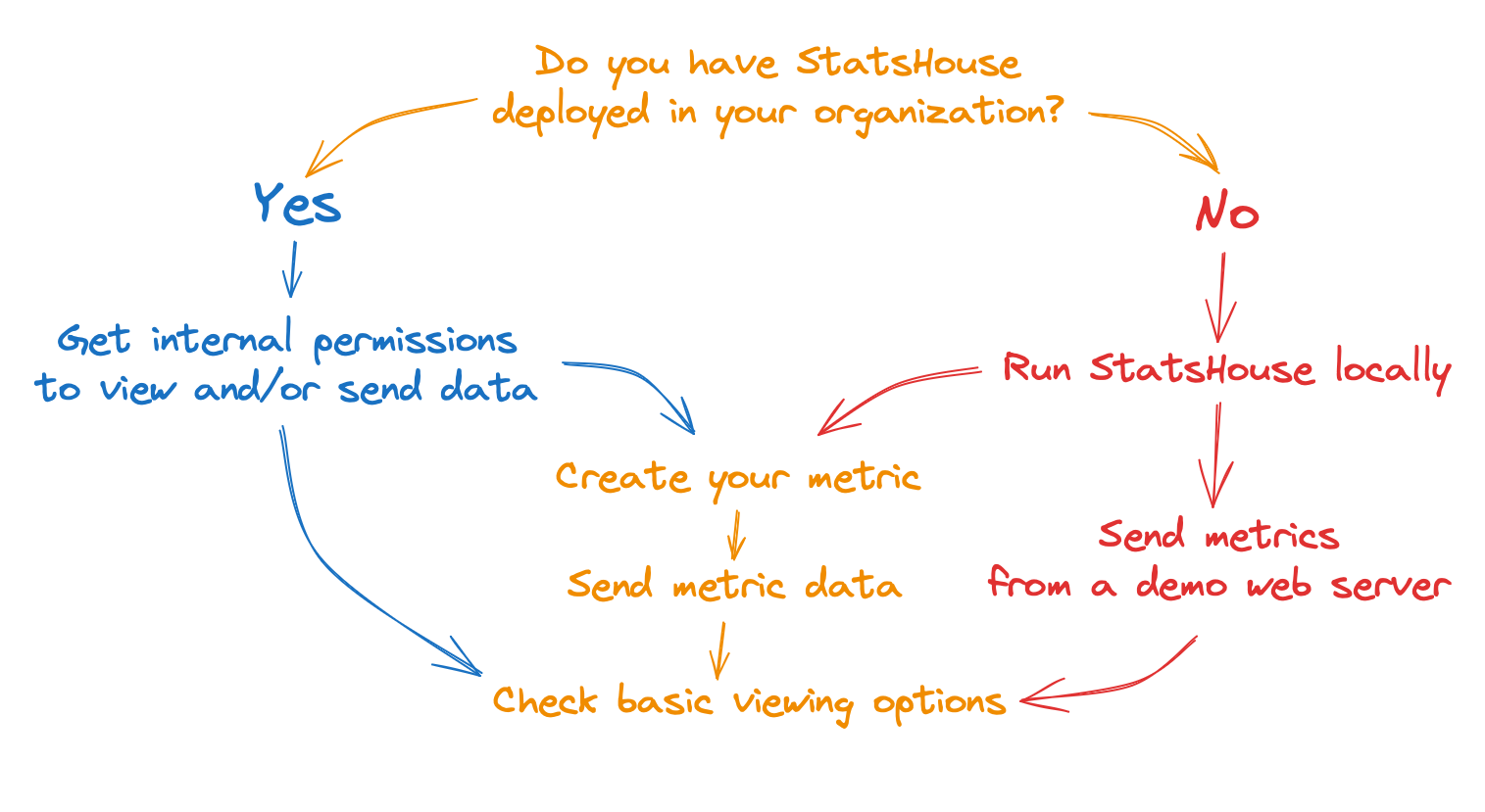
See the related sections below:
- Get internal permissions
- Run StatsHouse locally
- Send metrics from a demo web server
- Create your metric
- Send data to your metric
- Check basic viewing options
This tutorial is for Linux systems. For macOS or Windows, there may be Docker-related issues.
For detailed instructions on how to create, send, and view metrics, please refer to the user guide.
Get internal permissions
If you have StatsHouse deployed in your organization, please contact your administrators to get the necessary access.
Run StatsHouse locally
Make sure you have Docker installed.
Clone the StatsHouse repository, go to the StatsHouse directory, and run a local StatsHouse instance:
git clone https://github.com/VKCOM/statshouse
cd statshouse
./localrun.sh
The StatsHouse UI opens once it is ready.
Send metrics from a demo web server
From the StatsHouse directory, run a simple instrumented Go web server—it will send metrics to your local StatsHouse instance:
go run ./cmd/statshouse-example/statshouse-example.go
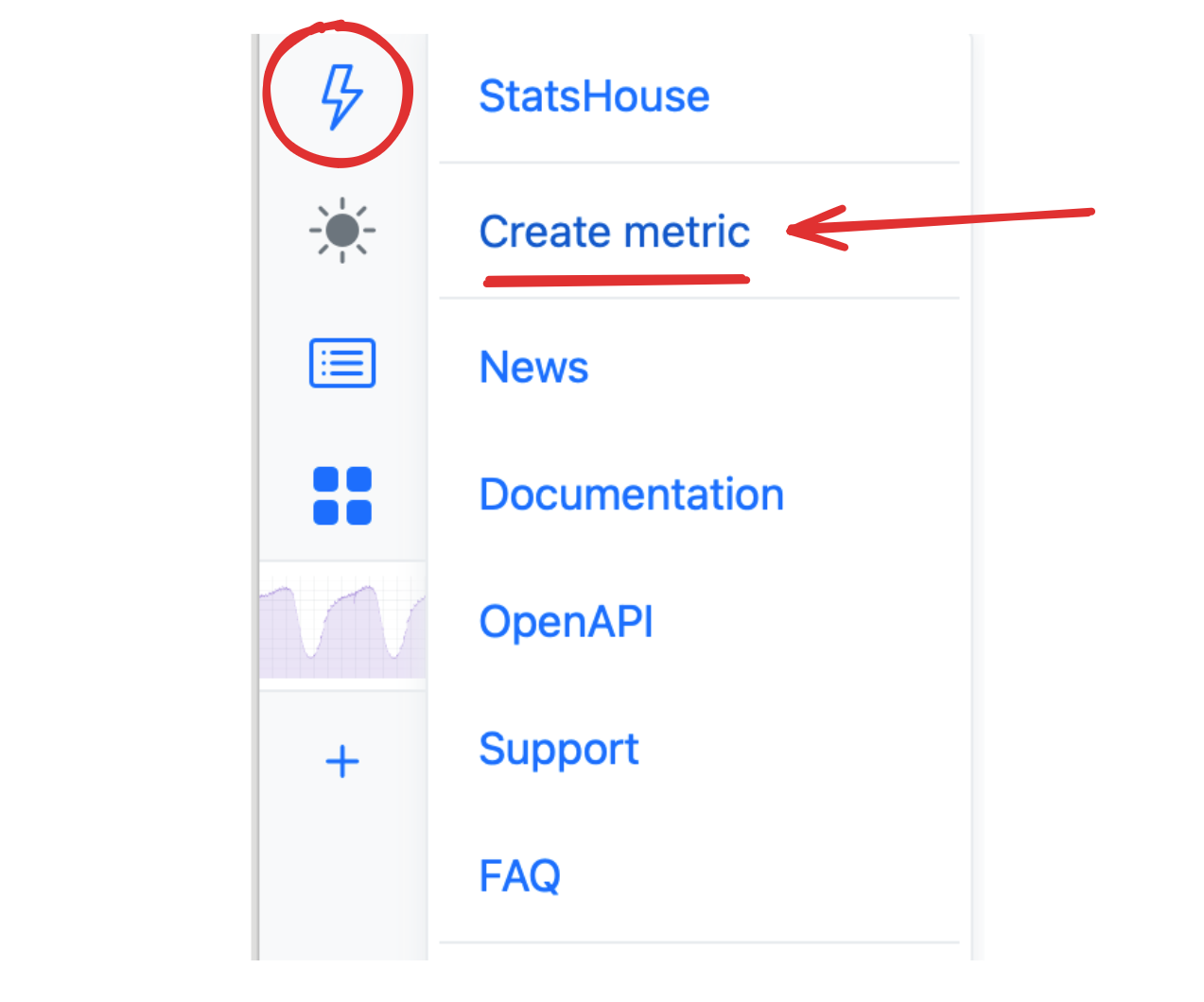
Create your metric
Go to the main ⚡ menu in the upper-left corner and select Create metric:
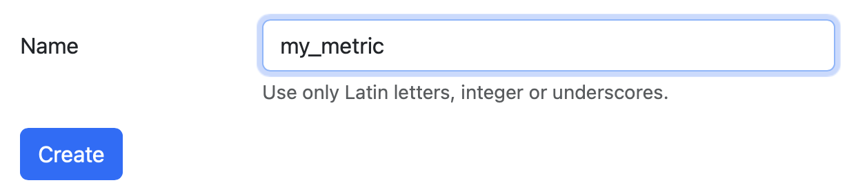
Name your metric:
Read more about creating metrics.
Send data to your metric
For this toy example, use a simple bash script:
echo '{"metrics":[{"name":"my_metric","tags":{},"counter":1000}]}' | nc -q 1 -u 127.0.0.1 13337
Read more about metrics in StatsHouse and sending metric data.
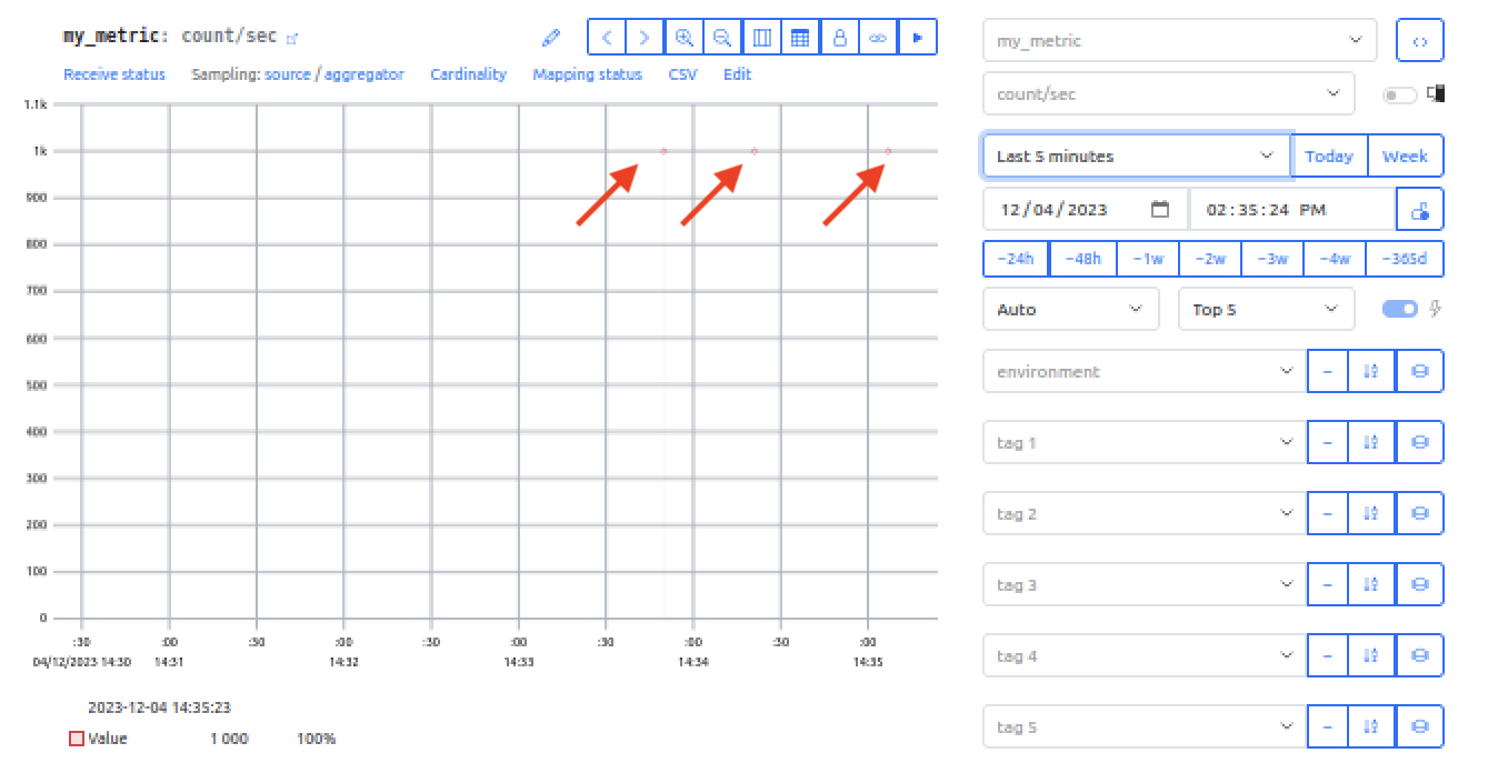
View the metric on the StatsHouse dashboard at localhost:10888.
In this example, we sent the same metric data three times:
Read more about viewing metrics on a graph.
Check basic viewing options
Find the basic viewing options on a picture and their descriptions below:
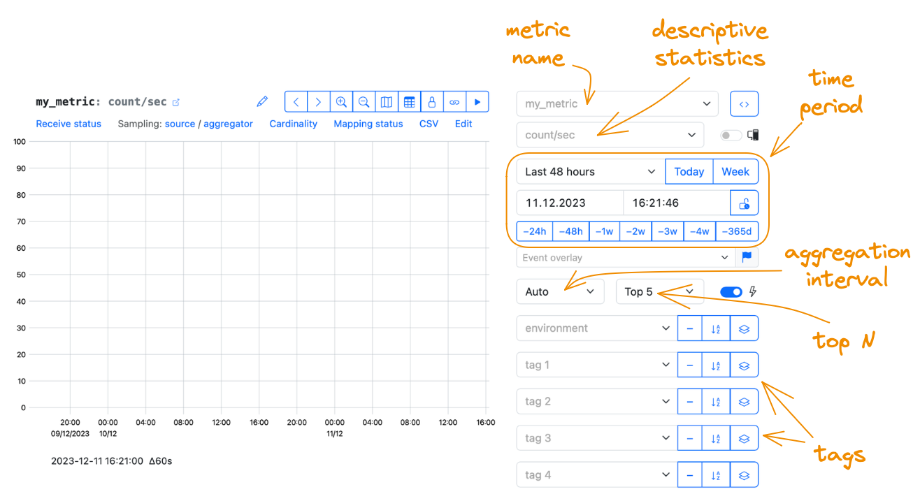
Metric name
Choose the name of your previously created metric or refer to someone else's one. Learn how to refer to existing metrics and check the related warnings.
Descriptive statistics
They are statistical functions that quantitatively describe or summarize metric data. Choose if you want to show them on a graph. The most common ones are:
- count and count/sec,
- sum and sum/sec,
- average,
- standard deviation,
- minimum and maximum.
There are more statistics available. The range of descriptive statistics that are meaningful for a metric is related to a metric type. For example, percentiles are available for values only.
In this dropdown menu, you can see statistics, which may be not relevant for your metric type. If you pick them, you will see 0 values for them on a graph. To switch off showing irrelevant statistics in this dropdown menu, specify the metric type in the UI.
If you choose to show count or sum as a descriptive statistic, while an aggregation interval is set to Auto, the resulting graph may look difficult to grasp.
Instead, choose the count/sec and sum/sec statistics. These are normalized data, which are independent of an aggregation interval.
Read more about descriptive statistics.
Time period
Display data for a specific time period: the last five minutes, last hour, last week, and more—even for the last two years.
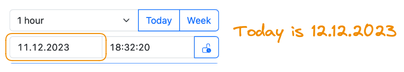
Choose a particular date and particular time. And you can combine the controls: for example, you can display the last-hour data for the previous day:
Compare the data for a chosen time period with the data for the same period in the past: a day, a week, a year ago.

When choosing time periods, please be aware of a chosen aggregation interval.
Make sure the chosen time period is larger than the aggregation interval. For example, choose a 7-day time period and a 24-hour aggregation interval.
For real-time monitoring, use Live mode.
Aggregation interval
Aggregation interval is a kind of resolution for your metric data. The larger aggregation interval you choose, the smoother look your graph has:
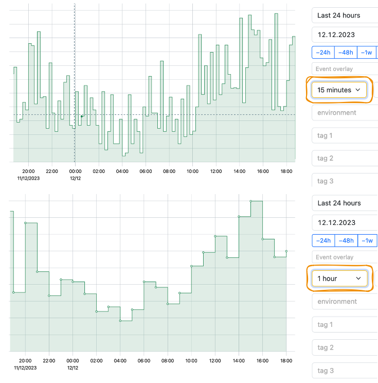
An Auto interval uses the minimal available interval_ for aggregation to show data on a graph. This interval varies depending on the currently available aggregation:
- per-second aggregated data is stored for the first two days,
- per-minute aggregated data is stored for a month,
- per-hour aggregated data is available forever.
The currently available aggregation is also related to a metric resolution.
Read more about aggregation in StatsHouse, and changing metric resolution.
Tags
Tags help to differentiate the characteristics of what you measure, the contributing factors, or a context. Filter or group metric data by available tags.
For example, a particular piece of data can be labeled as related to
- an environment:
production,development, orstaging; - parts of your application:
video,stories,feed, etc.; - a platform:
mobile,web, etc., - a group of methods, a version, or something else.
Tags with many different values such as user IDs may lead to mapping flood errors or increased sampling due to high cardinality. If you need to create such a tag, read more about tags with many different values.
Read more about filtering with tags, setting up and editing tags, and cardinality.
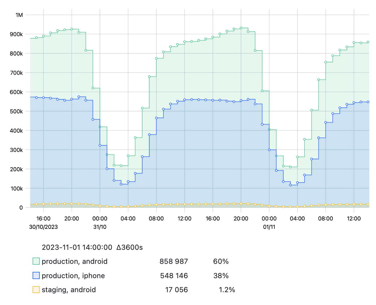
Top N
When grouping data by one or more tags, e.g., by environment and platform,
you may find that there are a lot of tag value combinations:
| Environment × Platform | web | iphone | android |
|---|---|---|---|
production | ✔️ | ✔️ | ✔️ |
staging | ✔️ | ✔️ | ✔️ |
testing | ✔️ | ✔️ | ✔️ |
If there are too many of them, use the Top N option to choose the number of combinations with the highest values to show on a graph.
So, if you choose Top 3, you will get, for example:
To try out full StatsHouse features, refer to the user guide.