View metric data
Display data on a graph, in a table, or as a CSV file via the StatsHouse UI. For complicated scenarios, query StatsHouse with PromQL. StatsHouse does not support viewing data via third-party applications.
To learn more about viewing options, refer to the picture below and the navigation bar.
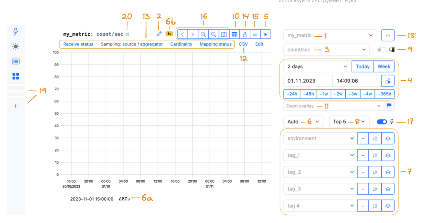
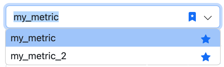
1 — Metric name
Choose a metric name to refer to existing metrics.
Do not commit configuration changes or send data to someone else's metric as you can spoil the metric or the related data.
Host metrics
Some popular host metrics are built-in such as CPU or disk usage, and more:
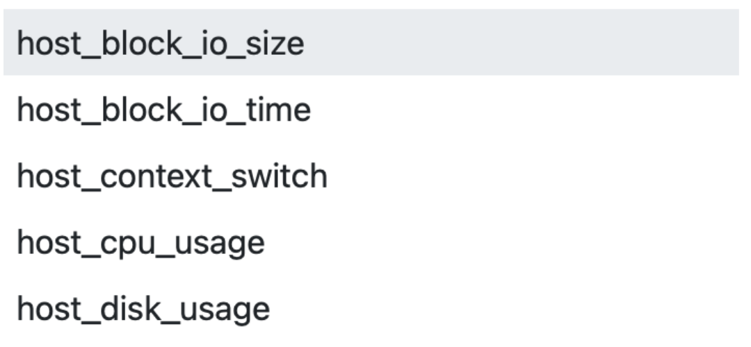
Host metric names begin with host_.
Find the full list of host metrics and their implementation on GitHub. For more details, see the Administrator guide.
Service metrics
Metrics having two underscores in the beginning are for StatsHouse internal use only, for example:
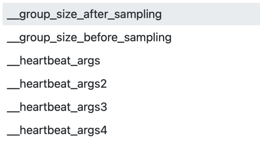
You cannot edit them. See Meta-metrics for details.
Common metrics
If you have StatsHouse deployed in your organization, you can find a set of metrics that are common for all the engines, services, microservices, proxies, etc. in the organization.
Favorite metrics
Mark the frequently used metrics as favorites — click on the "star" next to the metric name:
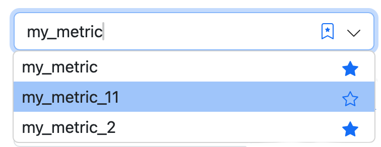
To display the list of your favorite metrics only, click on the "starred bookmark":
You can also mark dashboards as favorites.
"How can I find the metrics author?"
There is no mechanism for checking a metrics author in StatsHouse, but sometimes authors mention how to find them in the metric description section. Otherwise, use your organization's internal communication channels.
"How can I display several metrics on a graph?"
Query StatsHouse with PromQL. To compare metrics, create a dashboard. To find relationships between the metrics or events, use Event overlay.
2 — Graph name and description
You can edit the graph name so that the metric name remains the same.
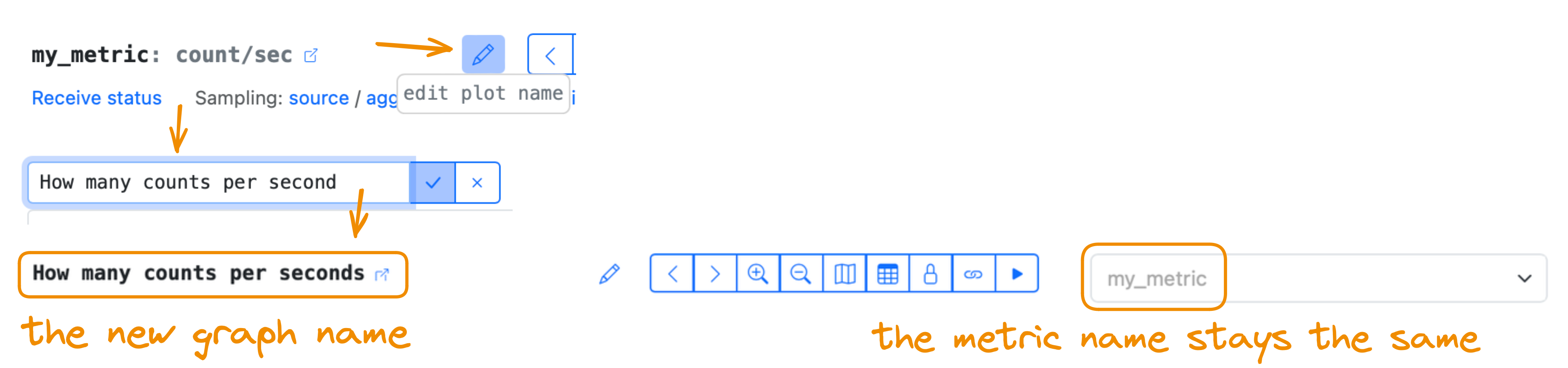
This changed graph name is saved in URL only.
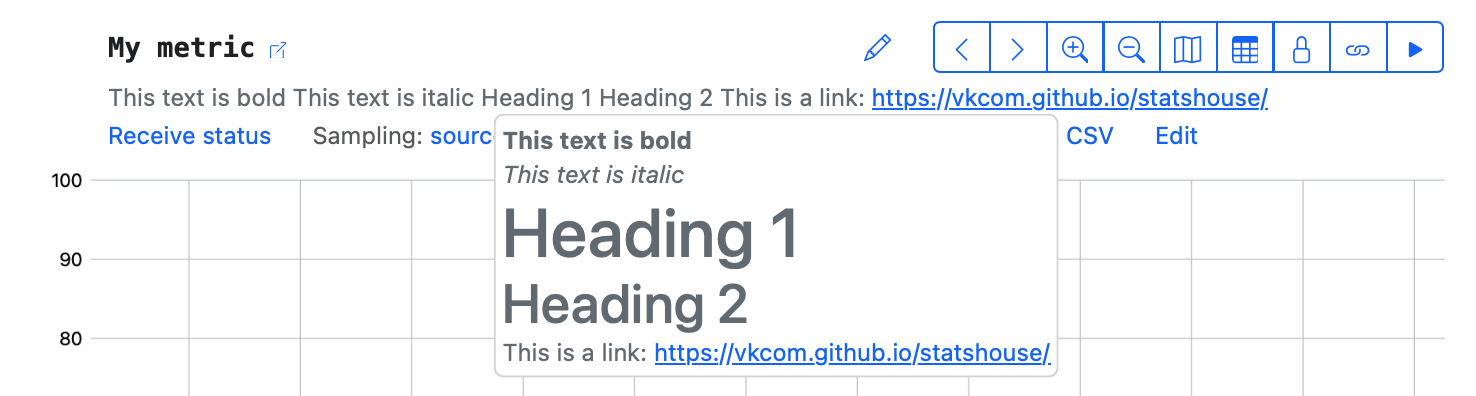
To add or modify a graph description, click the "pencil" icon near the graph name.
Feel free to use the standard Markdown formatting for descriptions.
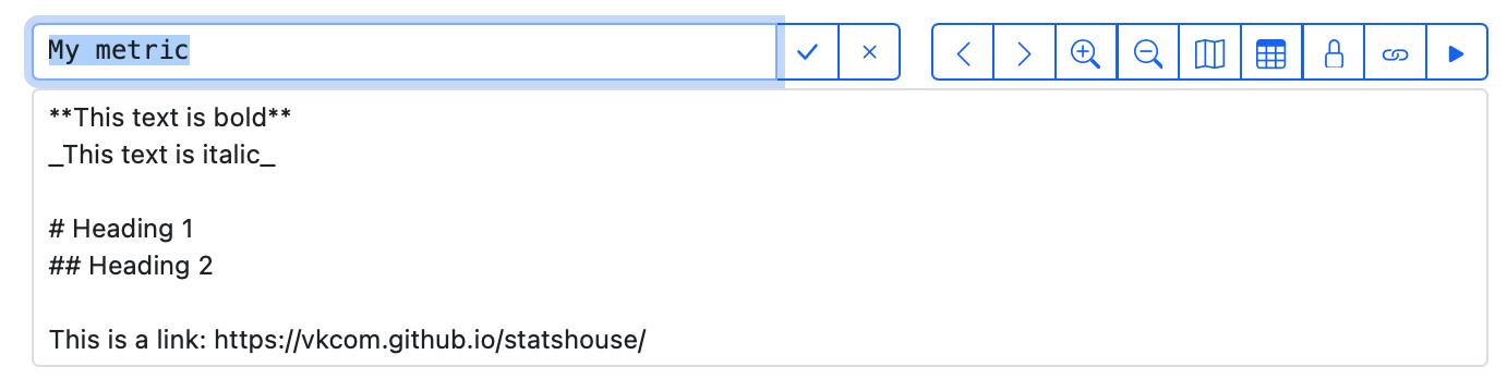
Please note that formatting appears only upon hovering over descriptions (in the "tooltip" descriptions).
3 — Descriptive statistics
They are statistical functions that quantitatively describe or summarize metric data:
- count and count/sec
- sum and sum/sec
- average
- stddev (standard deviation)
- minimum and maximum
- unique and unique/sec
- cumulative functions
- derivative functions
- percentiles
In this dropdown menu, you can see statistics, which may be not relevant for your metric type. If you pick them, you will see 0 values for them on a graph. To switch off showing irrelevant statistics in this dropdown menu, specify the metric type in the UI.
If you choose to show count or sum as a descriptive statistic, while an aggregation interval is set to Auto, the resulting graph may look difficult to grasp.
Instead, choose the count/sec and sum/sec statistics. These are normalized data, which are independent of an aggregation interval.
"Why do I see a non-integer number for a count statistic?"
Sampling coefficients should sometimes be non-integer to keep aggregates and statistics the same. This leads to non-integer values for the count statistic, which is an integer number at its core.
Cumulative functions
Cumulative functions are not meaningful for unique metrics.
Derivative functions
A derivative function shows the rate of change for the initial function, i.e., the difference between the two nearest function values.
Percentiles
Percentiles are available for value metrics only. To get them, enable percentiles in the UI.
Note that the amount of data increases for a metric with percentiles, so enabling them may lead to increased sampling. If it is important for you to have the lower sampling factor, keep an eye on your metric cardinality or choose custom resolution for writing metric data.
4 — Time period
Display data for a specific time period: the last five minutes, last hour, last week, and more—even for the last two years.
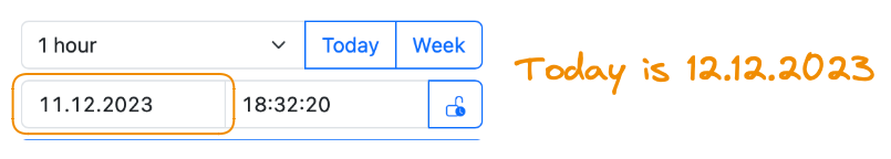
Choose a particular date and particular time. And you can combine the controls: for example, you can display the last-hour data for the previous day:
Compare the data for a chosen time period with the data for the same period in the past: a day, a week, a year ago.

When choosing time periods, please be aware of a chosen aggregation interval.
Make sure the chosen time period is larger than the aggregation interval. For example, choose a 7-day time period and a 24-hour aggregation interval.
For real-time monitoring, use Live mode.
5 — Live mode
Enable Live mode to view data in real time.
By default, the metric URL does not contain the Live mode parameter.
To share the link to real-time metric data, add the live=1 query string to the metric URL.
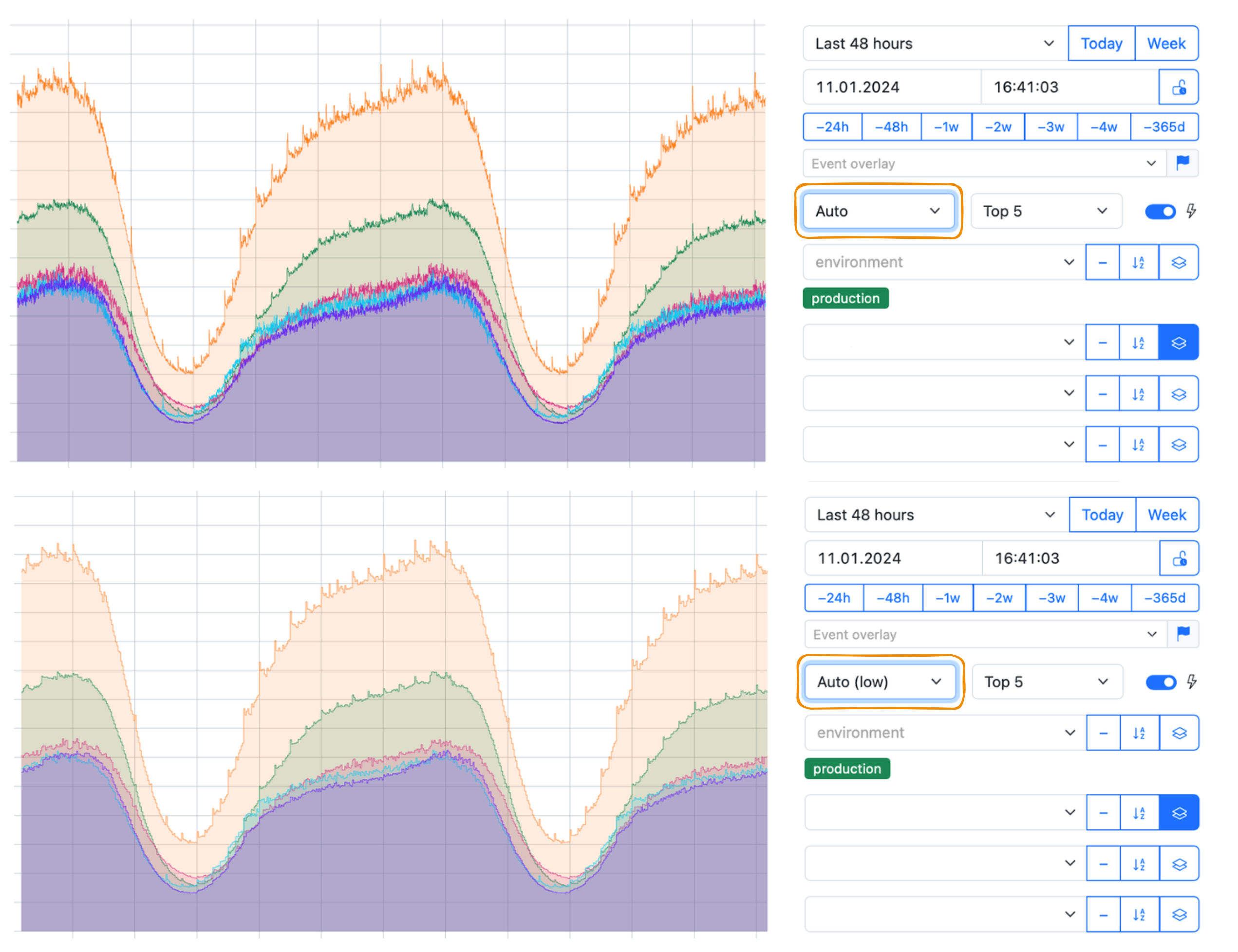
6 — Aggregation interval
Aggregation interval is a kind of resolution for your metric data. The larger aggregation interval you choose, the smoother look your graph has:
Auto and Auto (low)
An Auto interval uses the minimal available interval for aggregation to show data on a graph. This interval varies depending on the currently available aggregation:
- per-second aggregated data is stored for the first two days,
- per-minute aggregated data is stored for a month,
- per-hour aggregated data is available forever.
The currently available aggregation is also related to a metric resolution.
The Auto (low) aggregation interval reduces the displayed resolution by a constant making the graph look smoother even when you view data using the minimal available aggregation interval:
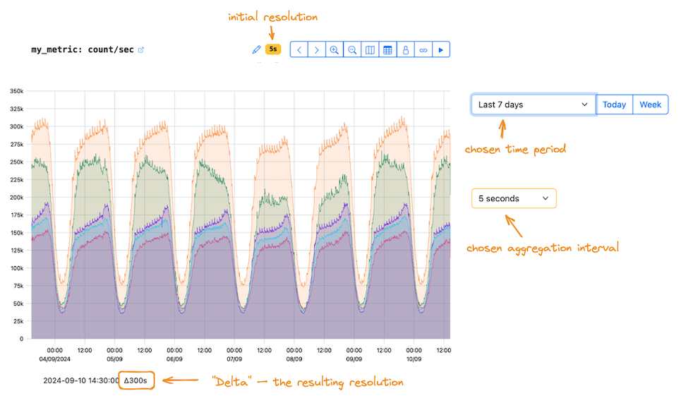
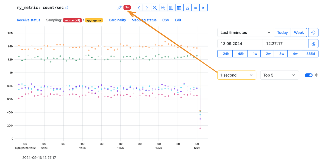
6a — "Delta"
The functionality described below will be redesigned.
The Δ ("delta") value indicates the aggregation interval (resolution) corresponding to the interval between the neighboring points on a plot.
-
When you choose a specific aggregation interval (not the Auto or Auto (low), but 1 second, 5 minutes, 1 hour, etc.), the "delta" shows the resulting aggregation to be displayed on a graph.
What does it depend on?
- On the initial resolution you use for sending data for your metric. The default one is to send data once per second, but you can send it once per 5 seconds, for example.
- On the minimal available aggregation interval. Per-second data is stored for the first two days, then aggregated to per-minute and per-second data.
- On the chosen aggregation interval. Per-second aggregates may be available, but you are free to choose per-hour aggregation.
- On the chosen time period. You can view data for an hour (fewer points to display) or a week (more points to display).
-
When you choose the Auto or Auto (low) aggregation interval, the "delta" shows the minimal available aggregation interval to be displayed on a graph — with regard to your display resolution. The display resolution affects the size of the graph in pixels. Sometimes the size of the graph does not allow you to display as many points as you need. So the data is displayed at a lower resolution.
For the Auto or Auto (low) aggregation interval, we recommend using the count/sec and sum/sec statistics. If you still do use the count and sum ones, pay attention to the "delta". In this case, the statistic shows the number of events for the time interval (which is the "delta" value), and can vary as well.
How it works in practice
Suppose StatsHouse has detailed data for a metric:
- it is initially written at a high, though not maximum, resolution (5 seconds);
- the data is still fresh (it has not turned into minute or hour aggregates);
- you have chosen a small aggregation interval in the interface (5 seconds also).
But:
- you requested data for a large time period (a week).
StatsHouse will display the data at NOT the 5-second resolution (as you wanted), but at the 300-second resolution: data with this aggregation interval (Δ300s) fits on the graph.
6b — Resolution
If the owner has set a custom resolution for a metric, it is displayed above the graph as the yellow badge.

If the custom resolution value is greater than the selected aggregation interval, the badge turns red.
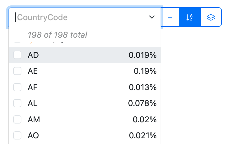
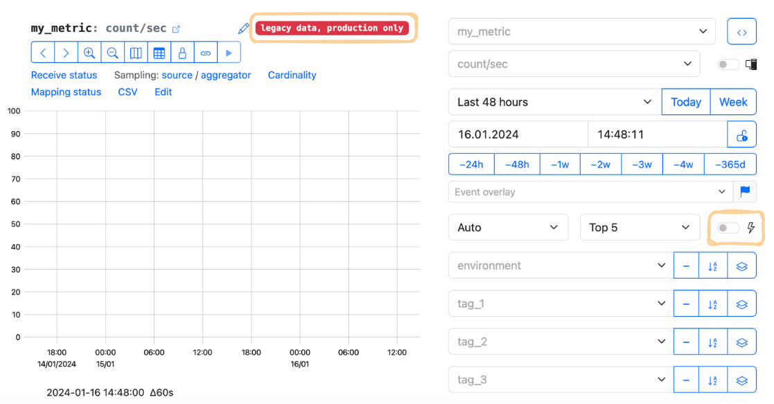
7 — Tags
Filter or group data on a graph using tags.
In the dropdown menu for each tag, choose the required tag values to show on a graph.
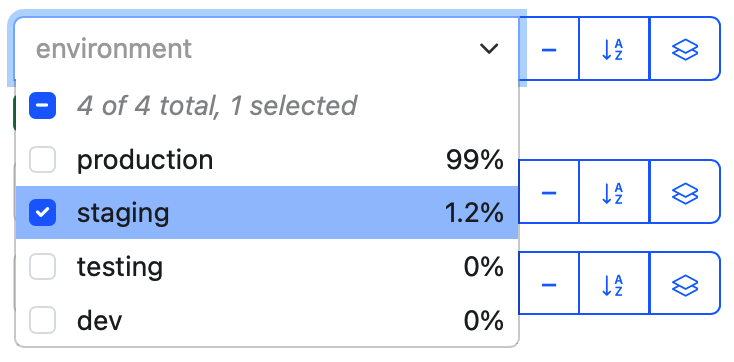
Hide the unnecessary tags in the UI, e.g., if you have less than 16 tags for your metric.
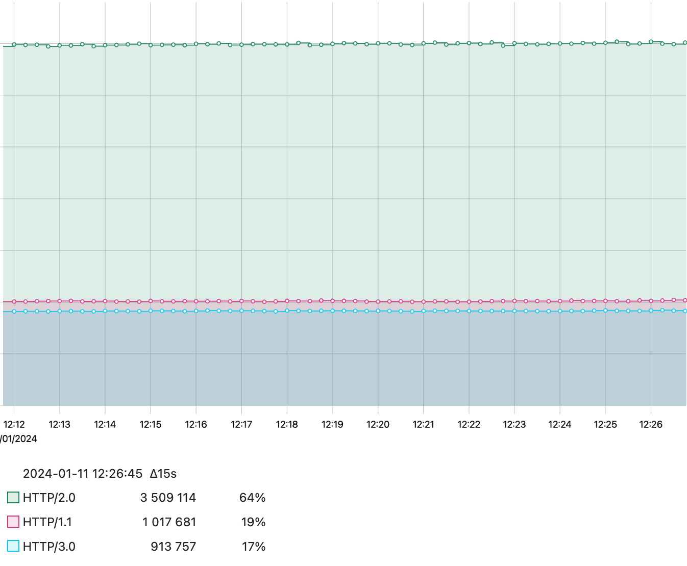
Group by tags
Group data by a single tag or multiple tags.
If there are many tag values or their combinations, use the Top N option to specify the number of groups shown.
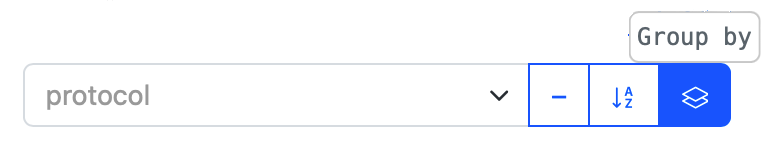
For example, see the data grouped by the tag protocol with the Top 3 tag values shown:
The default UI behavior is to use no grouping. There is no way to set up default grouping for a metric.
Sort alphabetically
Sort tag values in the dropdown menu alphabetically to get quicker access:
Negate next selection
Choose the tag value to exclude data from graph:
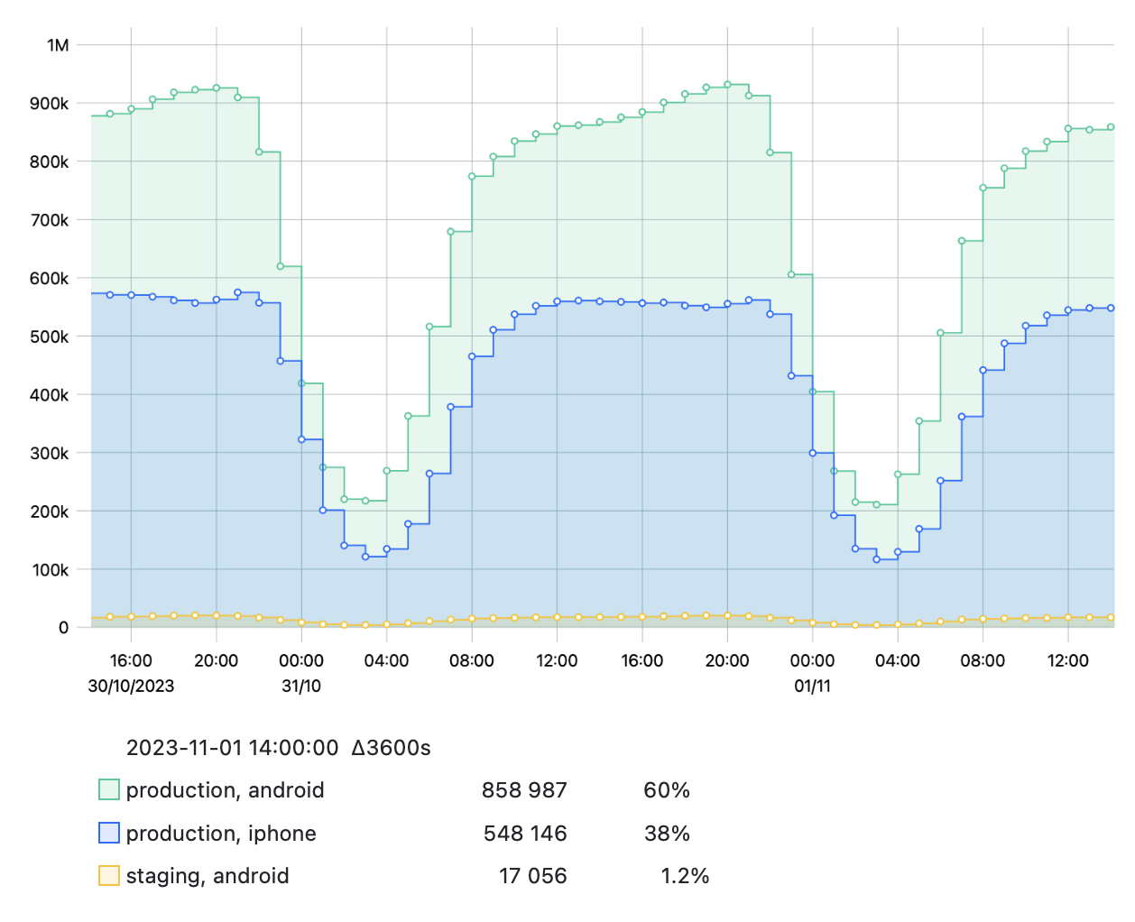
8 — Top N
When grouping data by one or more tags, e.g., by environment and platform,
you may find that there are a lot of tag value combinations:
| Environment × Platform | web | iphone | android |
|---|---|---|---|
production | ✔️ | ✔️ | ✔️ |
staging | ✔️ | ✔️ | ✔️ |
testing | ✔��️ | ✔️ | ✔️ |
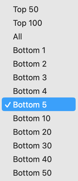
If there are too many of them, use the Top N option to choose the number of combinations with the highest values to show on a graph.
So, if you choose Top 3, you will get, for example:
To get the lowest values, choose one of the Bottom N options in the same dropdown menu:
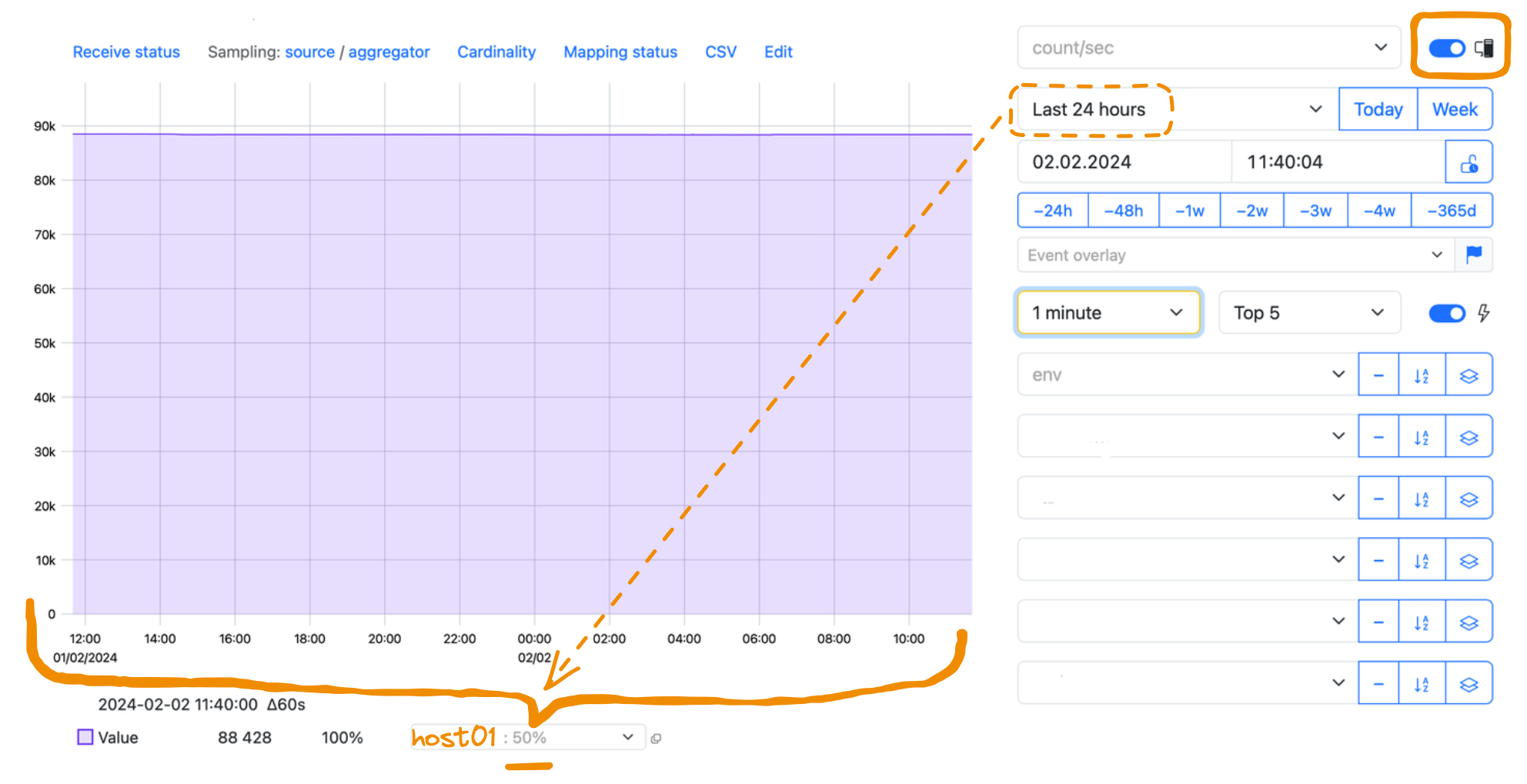
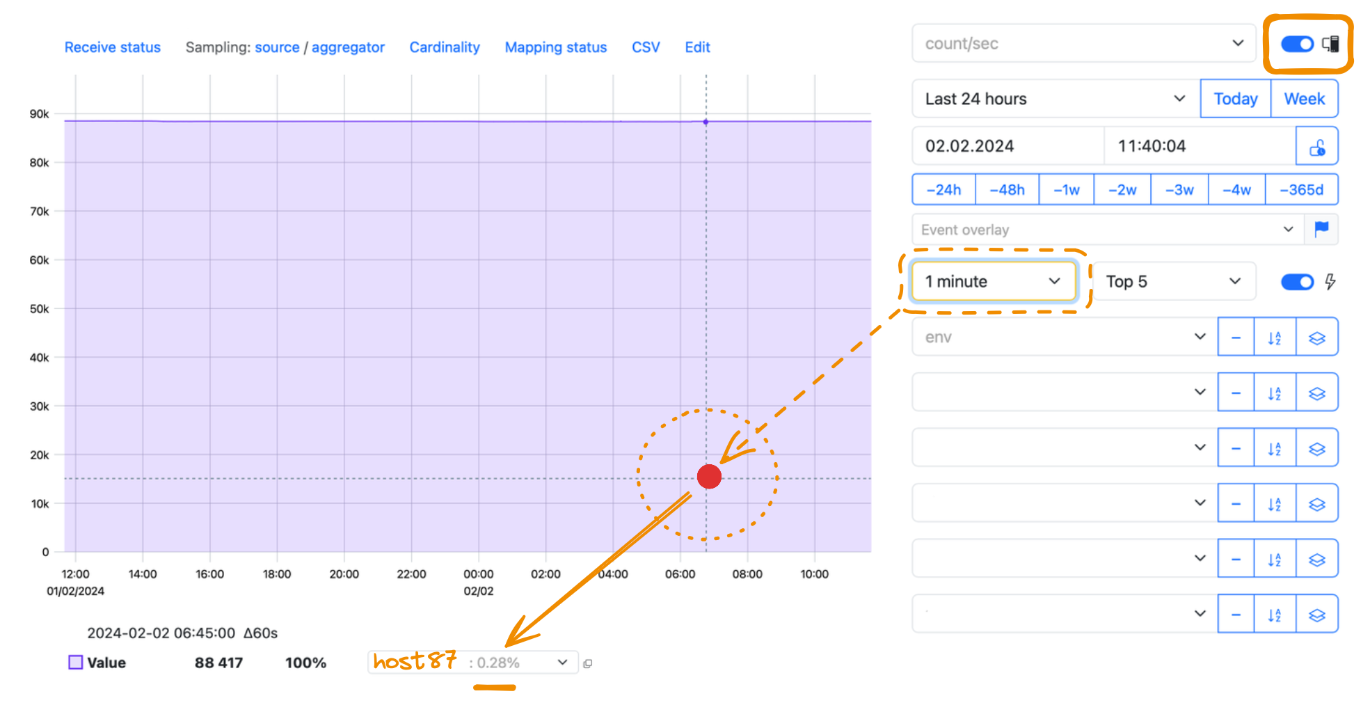
9 — Max host
Enable the Max host option to find the host that sends the maximum value for your metric:

View the list of all hosts sorted by the maximum value or copy the list to clipboard:
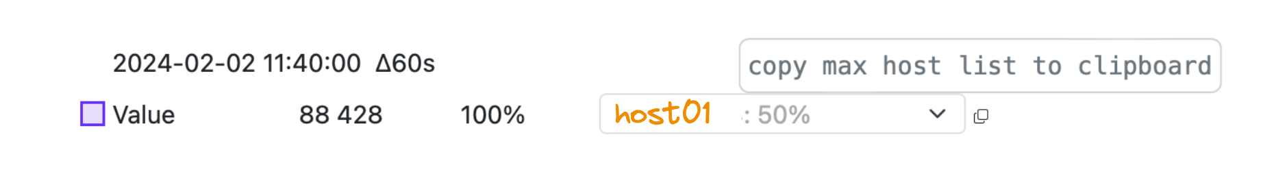
The idea of the maximum value is valid only with respect to the chosen time interval.
If you enable the Max host option and view the whole graph, you see the host that sends the value, which is the maximum in the whole time period—the Last 24 hours in the example below:
When you move the cursor over the graph, you see the resulting Max host changing. It now shows you the host that sends the value, which is the maximum for the available aggregation interval—in the example below, for the minute you are pointing at:
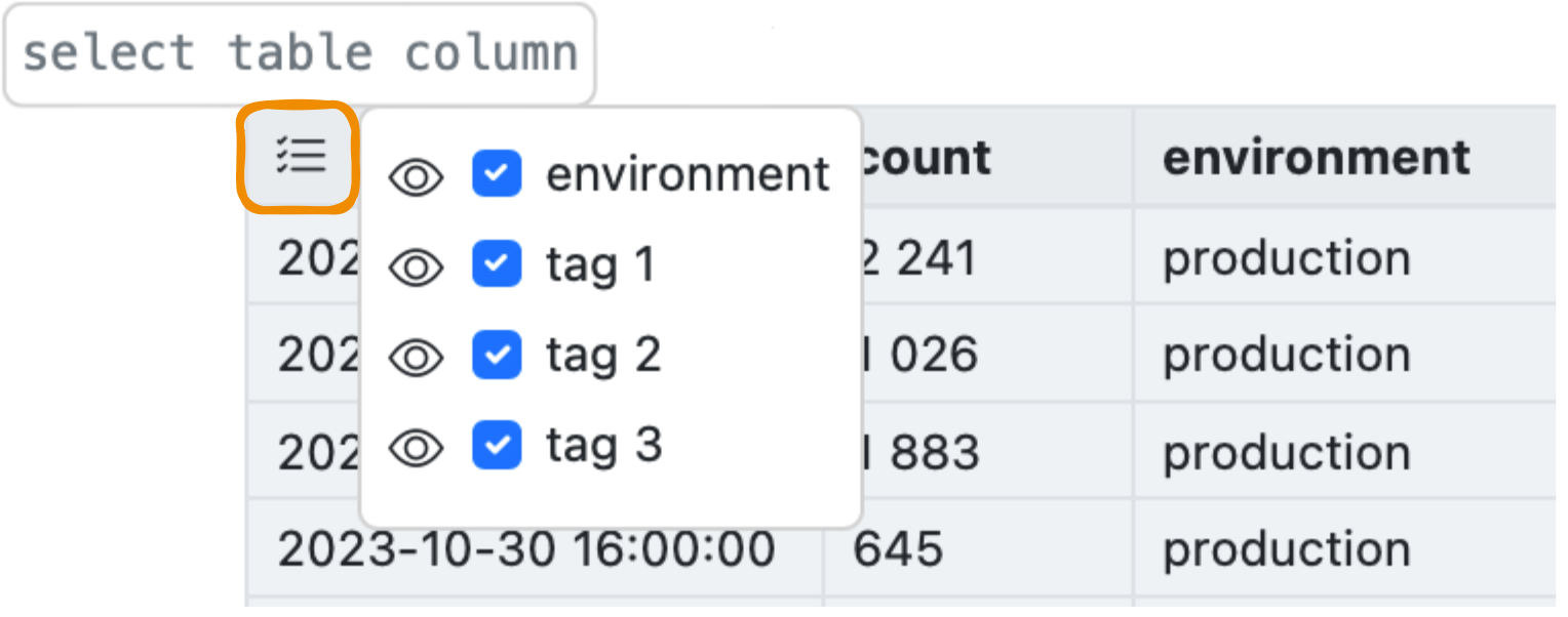
10 — Table view
View the metric events in a table, for example:
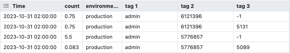
Choose the tags to show or hide as columns (an "eye" symbol), or to group by (a "checkmark" sign):
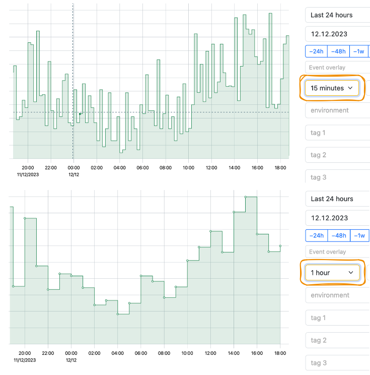
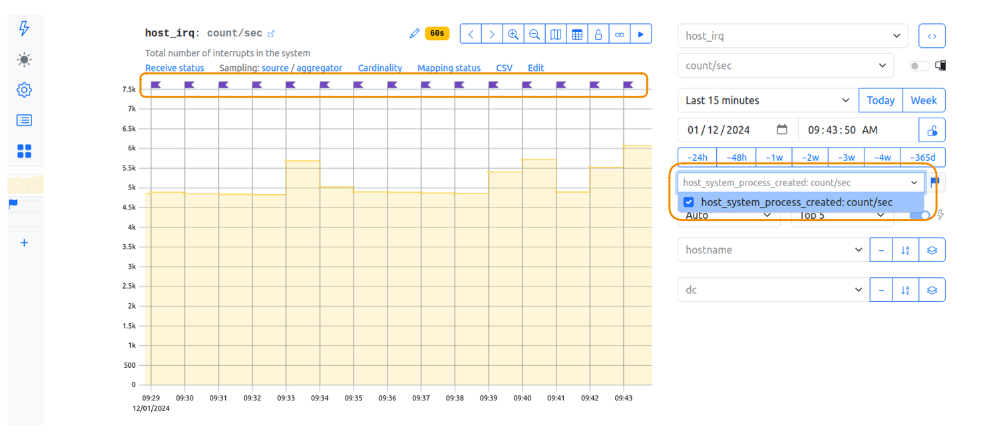
11 — Event overlay
Overlay a metric with the events of the other metric to find correlations.
- Choose the metric you want to overlay with events. Add the new metric tab:
- On the new metric tab, choose the second metric you are interested in. Enable the table view for this metric:
- Get back to the first metric. In the Event overlay dropdown menu, choose your second metric of interest. The event flags appear on a graph:
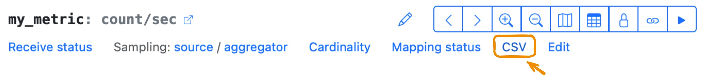
12 — CSV
Export metric data for a chosen time period to a CSV file:
13 — Meta-metrics
Metrics having two underscores in the beginning are meta-metrics. The most important ones are shown in the UI:
Some of these metrics may be not sampled at all. The Receive status and Sampling metrics are sent in a special compact form to save traffic.
Receive status
This meta-metric redirects you to the __src_ingestion_status metric.
It shows if there are errors when receiving metrics: whether data are formatted properly,
or a counter has a negative value, or a NaN value has been sent.
The red alert informs you about the errors:

Here are some error examples:
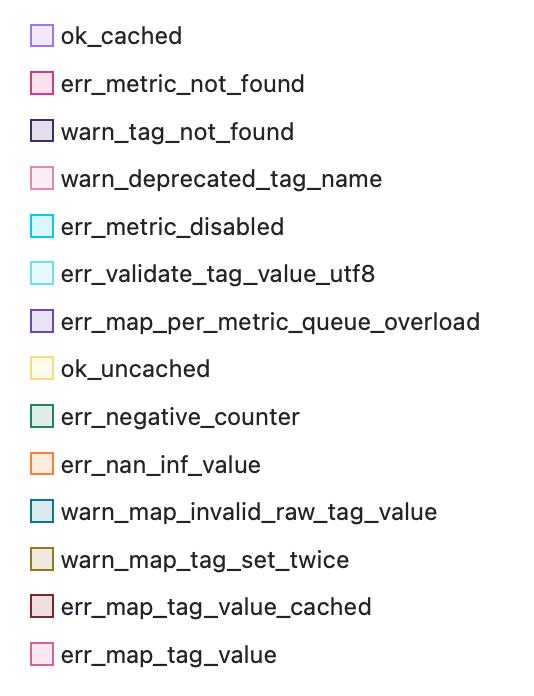
For example, the err_map_per_metric_queue_overload, err_map_tag_value, or err_map_tag_value_cached tags
indicate the slowdowns or errors of the mapping mechanism.
This metric uses the sampling budget of a metric it refers to, so the error flood cannot affect the other metrics.
The err_*_utf8 statuses store the original string values in hex.
Sampling
StatshHouse has two bottlenecks where it samples data: an agent and an aggregator. An agent is also referred to as source because it is the same machine the data come from.
Sampling means that StatsHouse throws away pieces of data to reduce its overall amount. To keep aggregates and statistics the same, StatsHouse multiplies the rest of data by a sampling coefficient (or a sampling factor).
The Sampling source/aggregator meta-metric redirects you to the sampling coefficient information for the agent and aggregation levels:
- to
__src_sampling_factorfor the agent (source), - to
__agg_sampling_factorfor the aggregator.
The non-integer sampling coefficients may lead to non-integer values for the count statistic.
If the sampling coefficient for a metric is higher than 1, it is displayed with a yellow alert.

If the sampling coefficient for a metric is higher than 5, it is displayed with a red alert.

The count statistic for this metric shows the number of agents having set this coefficient in a particular second.
Learn more about StatsHouse agents and aggregators, and what sampling is.
Cardinality
In StatsHouse, metric cardinality is how many unique tag value combinations you send for a metric.
The Cardinality meta-metric redirects you to the __agg_hour_cardinality metric:
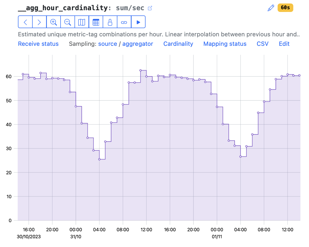
It shows the estimated hour cardinality for a metric. Estimation means linear interpolation between cardinality values for the nearest hours.
This cardinality estimation is based on data from all the aggregators and their shards. So an avg statistic for this metric shows full cardinality, which may be grouped by aggregator.
Mapping status
If you create too many tag values, which have not been mapped yet, the mapping flood errors appear:

Mapping errors indicate that the number of newly created tag values exceeds the mapping budget per day. Learn more about mapping and how many tag values to create per metric.
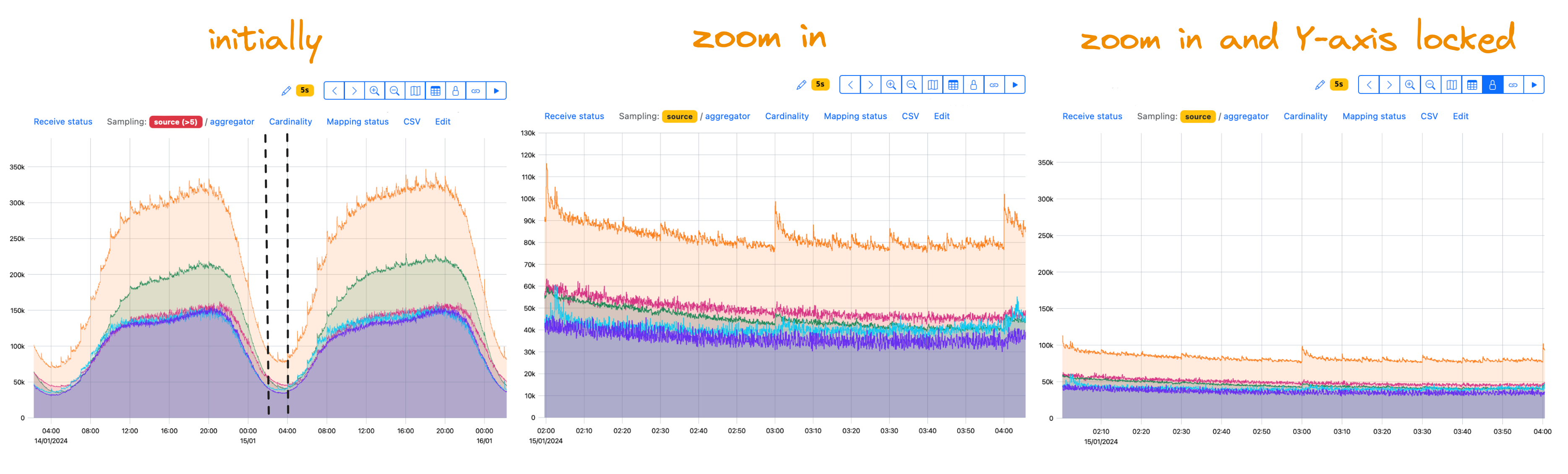
14 — Lock Y-axis
By default, the Y-axis is self-scaling—it adjusts itself to a data amplitude. You may need to lock it.
For example, your data normally vary in a range of 1–100, and you may see peaks sometimes. With the Lock Y-axis feature, you switch autoscaling off to view your data within a given range of values regardless of peaks. For data with daily variations, you may want to zoom in without Y-axis autoscaling:
If you need a logarithmic scale, switch to the PromQL query editor. Use standard PromQL functions:
15 — Copy link to clipboard
Adjust the viewing options in the UI—group or filter your data by tags—and share the link with these options included.
Please note that the only viewing option not included in the link is Live mode. Check the tip for sharing data with the Live mode option included.
If you have several metric tabs opened, the Copy link to clipboard option copies the link to the current metric tab only.
See also the Open in a new browser tab option.
16 — Zoom options
Move back and forth, zoom in or out for both X- and Y-axes.
To get back to the initial view, Reset zoom:
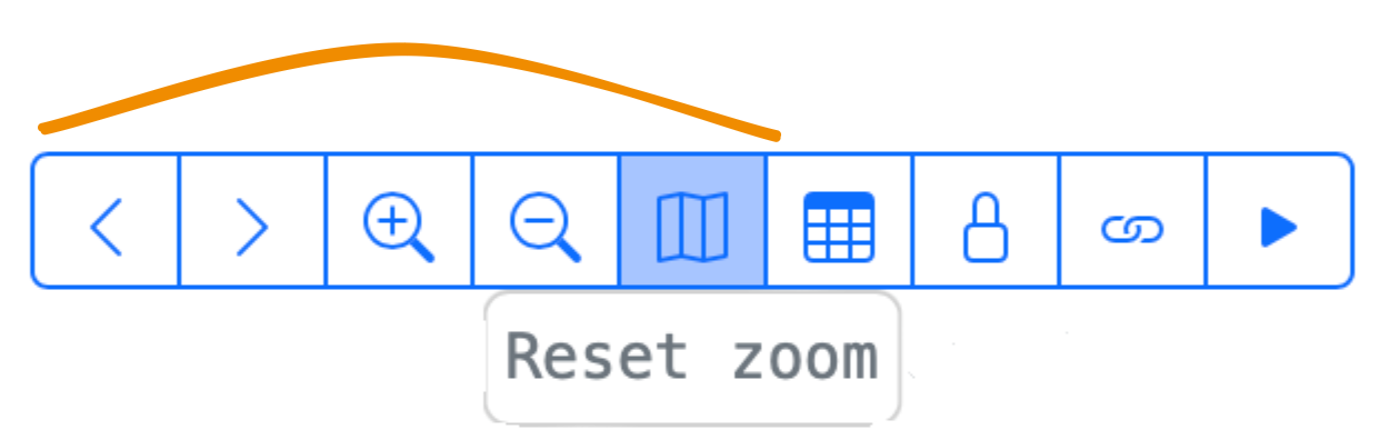
Switch off autoscaling Y-axis with the Lock Y-axis feature.
17 — Switch database
Previously, StatsHouse used a slower database that still stores useful historical data. In most cases, you should not switch to this slow database—you will probably see no data and a warning:
18 — PromQL query editor
To broaden the range of operations available when viewing data, we supported PromQL, or Prometheus Query Language.
Switch to PromQL query editor for complex viewing scenarios:
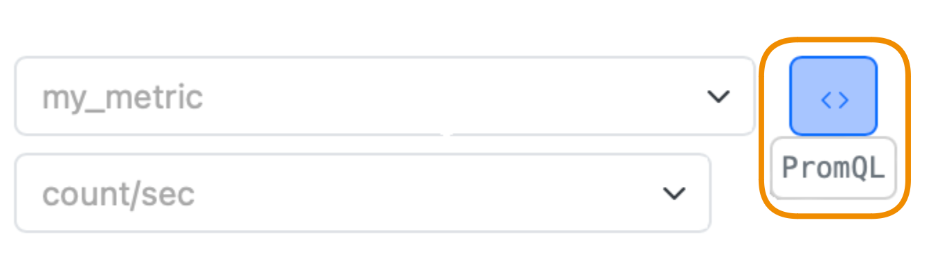
You will get an autogenerated PromQL query describing the current graph view.
Use the PromQL editor to run your queries. To switch back to graph mode, press Filter:
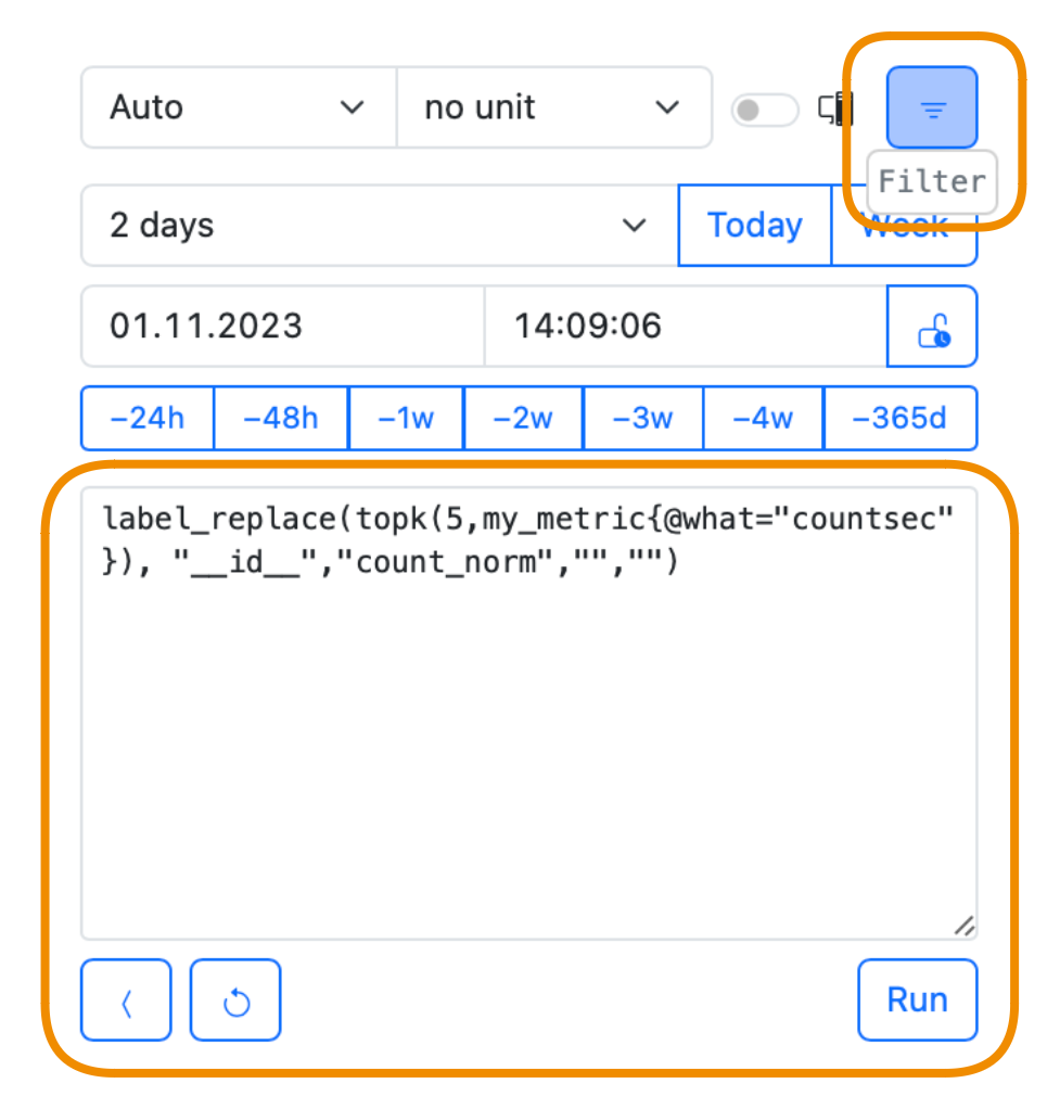
Learn how to query with PromQL in detail.
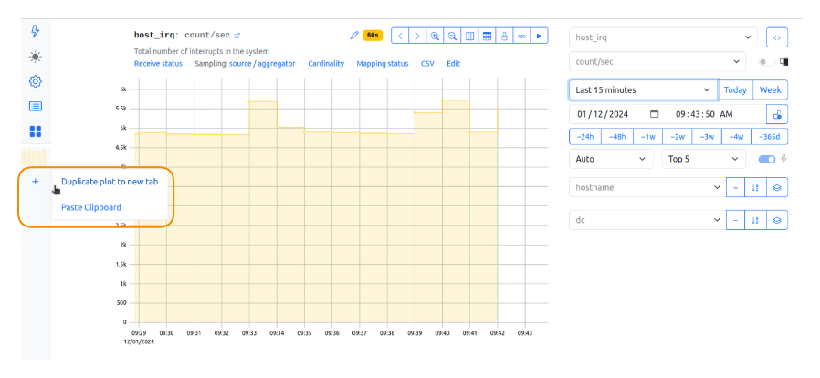
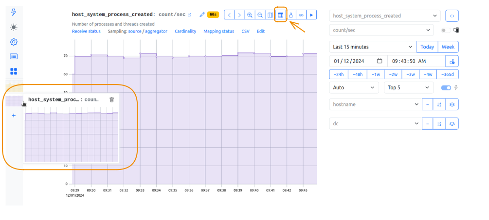
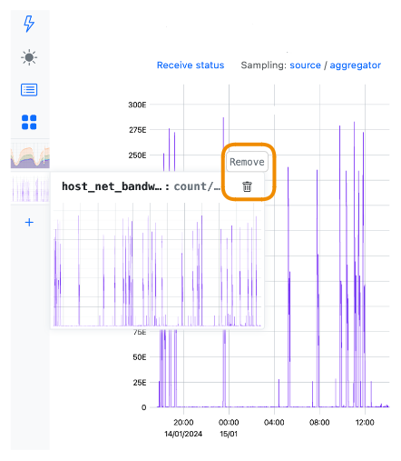
19 — Metric tabs
Use Metric tabs to create dashboards or to overlay metric events. Duplicate the current graph view to a new tab and choose the other metric, or copy the graph's URL and paste it to a new metric tab:
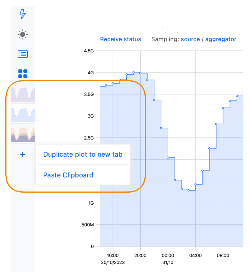
Remove the tab if necessary:
20 — Open in a new browser tab
This option implements the same behavior as the Copy link to clipboard but instead of copying the link it opens it in the new browser tab.
All the Copy link to clipboard limitations apply: only the current metric tab is opened, and Live mode is not included.